
In 2026, anyone can generate a “decent” image using AI or a drag-and-drop template. But when you look closely, something often feels… off. The design might be colorful, but it lacks impact. It feels messy, confusing, and ultimately, amateurish.
Why? Because true professional graphic design isn’t about flashy effects. According to a brilliant breakdown by Satori Graphics in his video “8 Graphic Designs Tips That Make Amateur Work An Impossibility!”, the secret lies in mastering the “invisible rules” of design.
If you are a business owner evaluating creative work, or a designer looking to level up, here are the core fundamentals that guarantee a premium result.
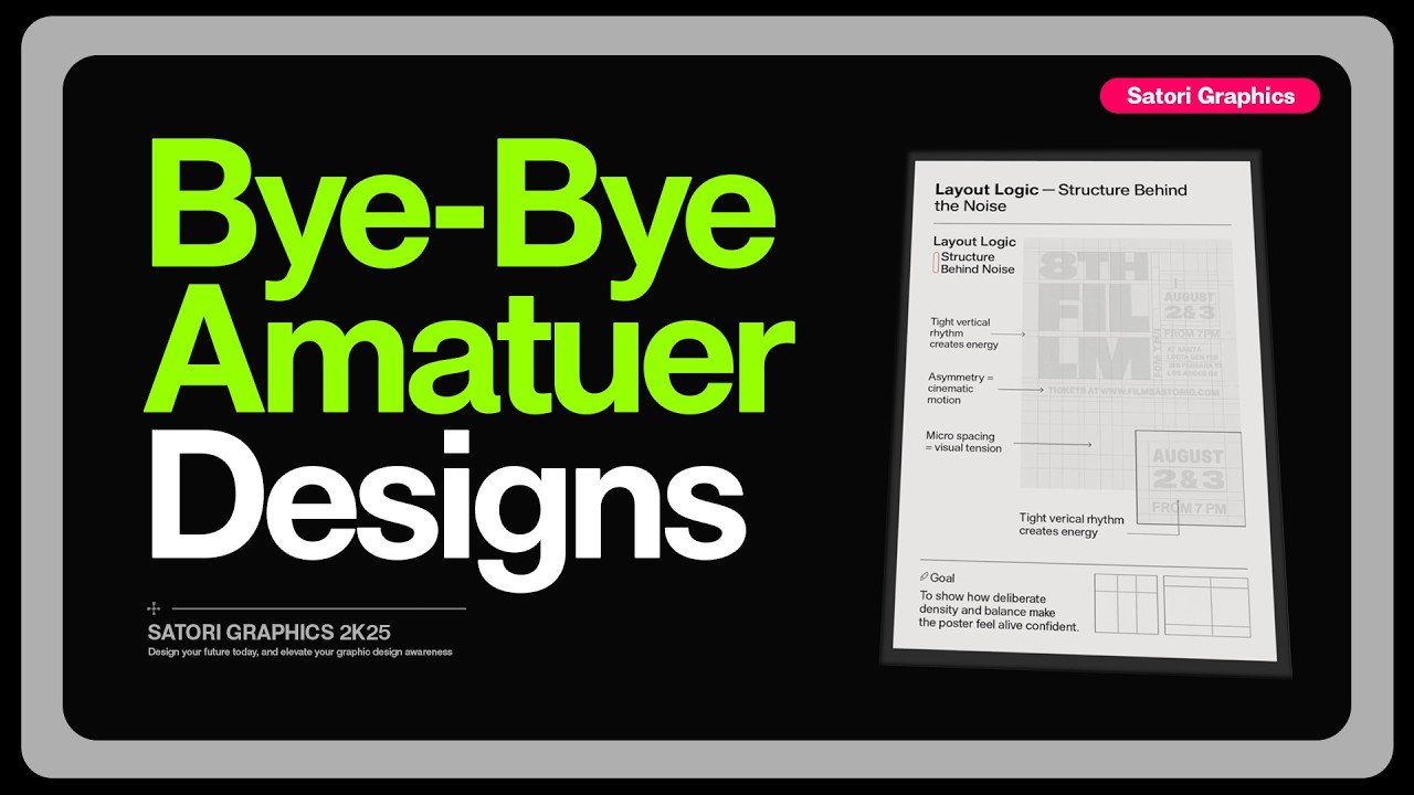
1. Building Design Systems, Not Isolated Layouts Amateurs start every single poster, ad, or webpage from scratch. That is exhausting and leads to inconsistent branding. Professionals build Design Systems. Before placing a single image, they spend time establishing a grid logic, margin rules, and spacing rhythms based on the brand’s brief. Once the foundation is laid, creating multiple cohesive assets becomes incredibly fast and visually consistent.
2. The Mathematical Typography Ramp Randomly guessing font sizes is the fastest way to make a design look sloppy. Professionals use a mathematical scale (like the golden ratio of 1.618) to determine their typography. For example: Body text at 11pt, secondary text at 18pt, primary headlines at 29pt, and hero titles at 47pt. This creates a neat, related, and highly professional visual hierarchy.
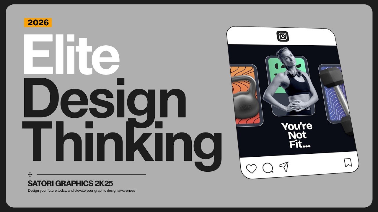
3. The “10-Second Test” for Clarity Amateur designs often suffer from “everything everywhere all at once.” They cram 12 different messages, multiple logos, and QR codes into one layout. To fix this, use the 10-Second Test: show the design to someone and ask, “What is the ONE idea here?” If they hesitate, you need to cut the visual noise. Group secondary information (like sponsors or dates) into a tiny footer strip and let the main message breathe.
4. Mastering The 80/20 Split of Visual Logic Most of a design’s impact comes from invisible forces: alignment, the tension between two elements, and how white space breathes between text and images. For instance, centering a product perfectly in the middle of an ad can feel lifeless. But if you offset it slightly, twist it, and balance it with clever typography, it suddenly belongs in a high-end luxury magazine.
Stop Guessing, Start Growing As the industry matures and AI tools become more common, there is zero tolerance for “good enough” or sloppy fundamentals. Your brand deserves design that is intentional, elegant, and built on rock-solid principles.
At Foxtrot Studio Bali, we don’t just push pixels—we apply these elite design systems to every project we touch. With our Unlimited Design Subscription, your business gets direct access to premium, fundamental-driven design without the premium agency price tag. Let’s elevate your brand’s visual identity today!


Leave a Reply